1
2
3
4
5
6
7
8
9
10
11
12
13
14
15
16
17
18
19
20
21
22
23
24
25
26
27
28
29
30
31
32
33
34
35
36
37
38
39
40
41
42
43
44
45
46
47
48
49
50
51
52
53
54
55
56
57
58
59
60
61
62
63
64
65
66
67
68
69
70
71
72
73
74
75
76
77
78
79
80
81
82
83
84
85
86
87
88
89
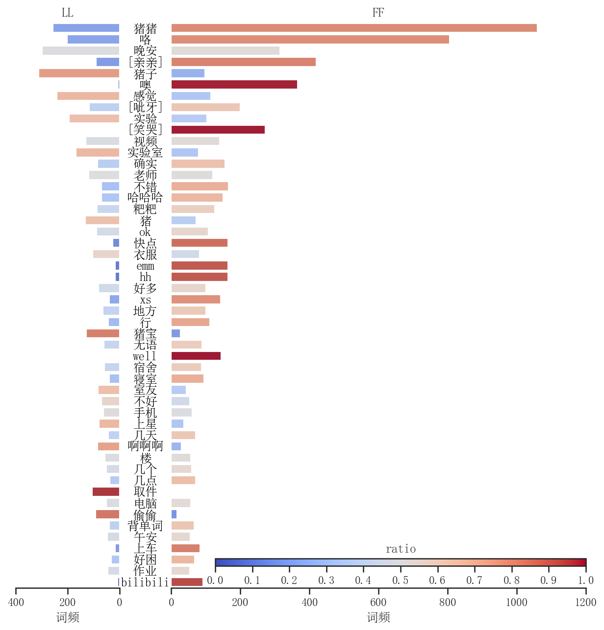
| wN = 50
data = pd.DataFrame(
{
"words": words[0] + words[1],
"L": [1] * len(words[0]) + [0] * len(words[1]),
"F": [0] * len(words[0]) + [1] * len(words[1]),
"S": [1] * len(words[0]) + [1] * len(words[1]),
}
)
grouper = pd.Grouper(key="words")
data = data.groupby(grouper).sum()
data = data.sort_values(by="S", ascending=False)
data = data.iloc[:wN]
tmp = data.index.to_list()
for i in range(wN):
if tmp[i] == "😘":
tmp[i] = "[亲亲]"
elif tmp[i] == "😂":
tmp[i] = "[笑哭]"
elif tmp[i] == "🤦":
tmp[i] = "[捂脸]"
elif tmp[i] == "😁":
tmp[i] = "[呲牙]"
data.index = tmp
ratio = data["L"] / data["S"]
norm = plt.Normalize(0, 1)
sm = plt.cm.ScalarMappable(cmap="coolwarm", norm=norm)
fig = plt.figure(figsize=(10, 10), dpi=300)
grid = plt.GridSpec(1, 4, wspace=0.5)
ax0 = fig.add_subplot(grid[0, 0])
sns.barplot(x=-data["L"], y=data.index, ax=ax0, hue=ratio, hue_norm=norm, palette="coolwarm")
ax1 = fig.add_subplot(grid[0, 1:])
sns.barplot(x=data["F"], y=data.index, ax=ax1, hue=(1 - ratio), hue_norm=norm, palette="coolwarm")
ax0.set_xlabel("词频")
ax0.set_ylabel("")
ax0.set_xticks(range(-400, 1, 200))
ax0.set_xticklabels([400, 200, 0])
ax0.set_xlim(-400, 0)
ax0.set_yticks([])
ax0.spines["left"].set_visible(False)
ax0.spines["top"].set_visible(False)
ax0.spines["right"].set_visible(False)
ax0.set_title("LL")
ax0.get_legend().remove()
ax1.set_xlabel("词频")
ax1.set_ylabel("")
ax1.set_xticks(range(0, 1201, 200))
ax1.set_xticklabels([0, 200, 400, 600, 800, 1000, 1200])
ax1.set_xlim(0, 1200)
ax1.set_yticks([])
ax1.spines["left"].set_visible(False)
ax1.spines["top"].set_visible(False)
ax1.spines["right"].set_visible(False)
ax1.set_title("FF")
ax1.get_legend().remove()
axpos = ax1.get_position()
caxpos = mtransforms.Bbox.from_extents(axpos.x0 + 0.06, axpos.y0 + 0.03, axpos.x1, axpos.y0 + 0.04)
cax = ax1.figure.add_axes(caxpos)
locator = mticker.MultipleLocator(0.1)
formatter = mticker.StrMethodFormatter("{x:.1f}")
cax.figure.colorbar(sm, cax=cax, orientation="horizontal", ticks=locator, format=formatter)
cax.set_title("ratio")
x0 = ax0.get_position().x1
x1 = ax1.get_position().x0
xm = (x0 + x1) / 2
y0 = ax0.get_position().y0
y1 = ax0.get_position().y1
for i in range(wN):
fig.text(
xm, y0 + (y1 - y0) * (wN - i - 0.5) / wN, data.index[i],
color="black", ha="center", va="center", fontproperties=fp
)
fig.set_dpi(150)
plt.show()
plt.close()
|


 wechat